Visualizations with Xplorer
immediately visualizes the results of Simple Xplorer queries and Advanced Xplorer queries that have both a "group by" and "aggregation" clause (currently only "count" is supported). Consider the following example of an Advanced query, which queries for Security Incidents by category over a 6 month period:
SELECT  incident_category, sub_status, TIMESTAMP_TRUNC(time_opened, MONTH) AS month,
  count(*) as total
FROM cases
WHERE case_type = 'security_incident'
  AND incident_category IS NOT NULL
GROUP BY incident_category, sub_status,  month
ORDER BY incident_category ASC, sub_status ASC, month DESC
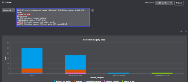
Custom Visualization editor
Clicking the edit button opens the Custom Visualization editor.
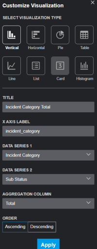
The Visualization Editor presents options to further refine the presentation of data for a Simple or Advanced Query. Use the Editor to specify a title and the X Axis label of the visualization. Visualization types that aren't supported for a particular query are grayed out. The following display options are supported by the available visualization formats:
- Vertical - Vertical bar chart with selection options for DATA SERIES 1 , DATA SERIES 2 and AGGREGATION COLUMN.
- Horizontal - Horizontal bar chart with selection options for DATA SERIES 1 , DATA SERIES 2 and AGGREGATION COLUMN.
- Line (Advanced queries only) - Line graph with selection options for the only DATA SERIES.
- Pie - Pie chart with selection options for the only DATA SERIES and AGGREGATION COLUMN.
- Table - Table with selection options for COLUMN. A maximum of 5 columns can be selected.
- List (Advanced queries only) - Standard list presentation with selection options for the only DATA SERIES and AGGREGATION COLUMN.
- Card (Advanced queries only) - A simple count visualization.
-
Histogram - Depicts the frequency distribution of variables in a data set with selection options for the only DATA SERIES and AGGREGATION COLUMN. You can narrow the time range by clicking a column, or clicking and dragging across a specific portion of the histogram,
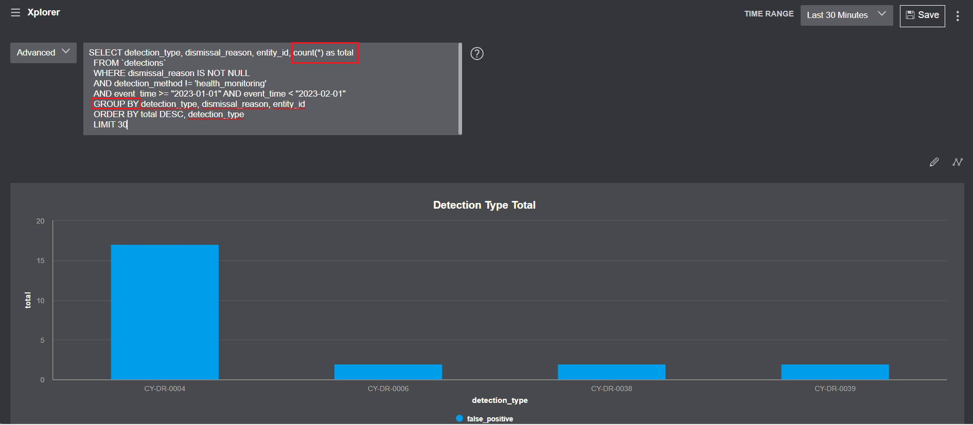
Example: The Visualization Editor shown above relates to the following Advanced Query example:
SELECT detection_type, dismissal_reason, entity_id, count(*) as total
  FROM `detections`
  WHERE dismissal_reason IS NOT NULL
  AND detection_method != 'health_monitoring'
  AND event_time >= "2023-01-01" AND event_time < "2023-02-01"
  GROUP BY detection_type, dismissal_reason, entity_id
  ORDER BY total DESC, detection_type
  LIMIT 30
It shows total dismissals for Health Incidents by dismissal reason and detection type over the past 30 minutes.
To show total dismissals for Health Incidents by dismissal reason and entity_ID over the past 30 minutes, use the Visualization Editor to specify entity_ID as the second data series.
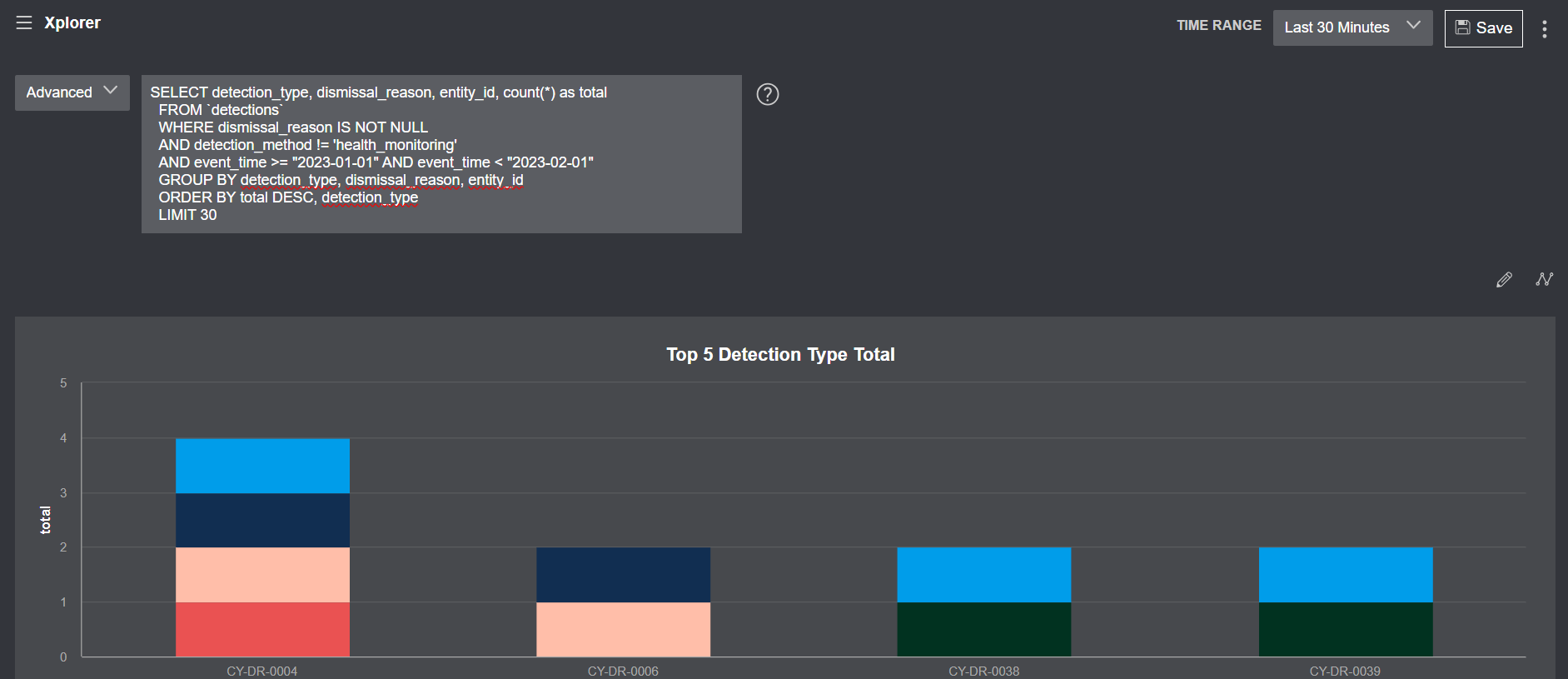
A maximum of 5 columns can be selected using the Visualization Editor.
The Card visualization type is not available with this query. To make it available specify a limit of 1, as follows:
SELECT detection_type, dismissal_reason, entity_id, count(*) as total
  FROM `detections`
  WHERE dismissal_reason IS NOT NULL
  AND detection_method != 'health_monitoring'
  AND event_time >= "2023-01-01" AND event_time < "2023-02-01"
  GROUP BY detection_type, dismissal_reason, entity_id
  ORDER BY total DESC, detection_type
  LIMIT 1
Saving Simple and Advanced Query Visualizations as a Custom Dashboard
Click the data select button and select between Create New Dashboard or Add to Existing Dashboard.
When you create a new dashboard, the visualization appears in one of several widgets. Once you specify a title for the dashboard, you can store it by clicking the Save button.
When you add to an existing dashboard, the list of available saved dashboards appears. Select the dashboard you want to add the visualization to and click the Save button.